Analytics is where you see how your academy is actually doing — how many learners you have, who is active, which courses land, and who might be slipping away. It reads live from your own workspace, so the numbers are always current. This article walks the whole page top to bottom, then follows the two places you can click through to for a closer look: a single course and a single learner.
Open the Analytics dashboard
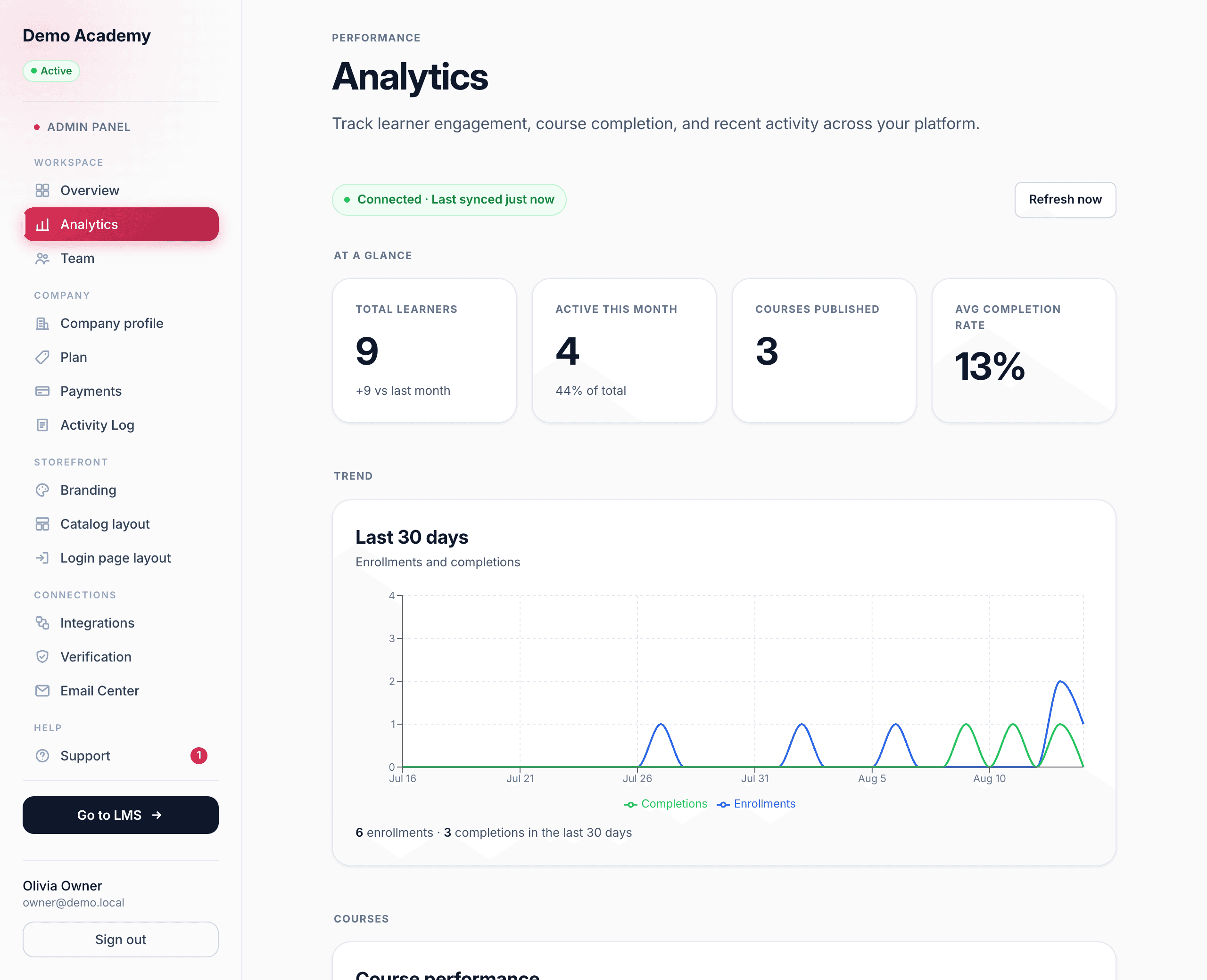
Go to Admin PanelAnalytics. It sits in the Workspace group of the sidebar, next to Team. The page is headed Analytics with the line “Track learner engagement, course completion, and recent activity across your platform.”
Is your data up to date?
At the very top sits a small status pill and a Refresh now button. Because Learn 360 is your LMS — the analytics come straight from your own database — the pill normally reads Connected · Last synced with how long ago that was. While a refresh is running it flips to an amber Syncing data with a pulsing dot, then settles back to Connected.
Refresh now re-pulls the latest figures and re-stamps the “last synced” time. Since the data is already live, you rarely need it — it’s there for when you want to be certain you’re looking at this exact moment.
The four headline numbers
Under At a glance are four tiles that sum up your whole academy:
- Total learners — everyone enrolled. When the count changed since last month, a small +N vs last month line appears beneath it.
- Active this month — how many have done something in the last 30 days, with X% of total underneath so you can see the share at a glance.
- Courses published — how many live courses learners can find.
- Avg completion rate — the average share of enrolled learners who finish.
The 30-day trend
Below the tiles, the Last 30 days chart plots two lines day by day — Enrollments (blue) and Completions (green) — so you can see the rhythm of people joining versus finishing. Hover any point for the exact counts on that date. A one-line summary underneath totals it up: how many enrollments and how many completions across the whole 30 days.
Course performance
The Course performance table lists every course with the numbers that matter, and the subhead tells you how many courses there are and reminds you that you can click a column to sort. The columns are:
- Course — the title (this is also a link — more below).
- Enrolled — how many learners are in it. The table opens sorted by this, most-enrolled first.
- Completion — the finish rate, colour-coded (green when strong, amber in the middle, red when low).
- Avg score — the average quiz score across everyone in the course.
- Pass rate — the share of quiz attempts that hit the passing mark.
- Avg time — the average number of days learners take to complete (shown as, say, 12d).
Click any column heading to sort by it; click the same heading again to flip the direction. Each row also has two ways forward: click the course name to open its full detail page, or click the Learners button on the right to jump straight down to the learners table with that course already applied as a filter.
The learners table
This is the heart of the page — every learner, with tools to slice the list any way you need. The header shows Showing X–Y of N (and, when a filter is on, “filtered from” your full total), plus a Per page selector on the right offering 10, 25, 50, or 100 rows at a time.
Search
The Search by name or email box at the top of the filter bar narrows the list as you type — use it to jump to one person without scrolling.
The four filters
Under the search box are four dropdowns you can combine:
- Course — a searchable menu of your courses (default All courses). Pick one to look only at the people in it.
- Status — All statuses, or filter to Active, At risk, Inactive, or New (defined at the end of this article).
- Last active — Active any time, Active today, Active this week, Active this month, or Inactive > 30 days.
- Completion — All learners, Has completed at least one course, or Has not completed any course, plus two options tied to a specific course: Completed selected course and Did not complete selected course.
Filter chips, sorting & paging
Every filter you turn on appears as a chip below the dropdowns — “Course: …,” “Status: Active,” and so on. Each chip has a small × to drop just that one, and a Clear all link resets everything at once. The columns — Name, Email, Status, Enrolled, Completed, Avg score, Last active — are all sortable (the list starts with the most recently active on top), and the footer pages through the results with Previous / Next and a Page X of Y readout. Click any learner row to open that person’s detail page.
Recent activity
At the bottom, the Recent activity feed is a running list of what just happened, each event with its own icon: a completion (someone finished a course), an enrollment, or a new sign-up. Each line carries a plain-English message and how long ago it was. A Load more button pulls the next batch; once you reach the end it reads “All recent events shown.”
Open a course (the course drill-down)
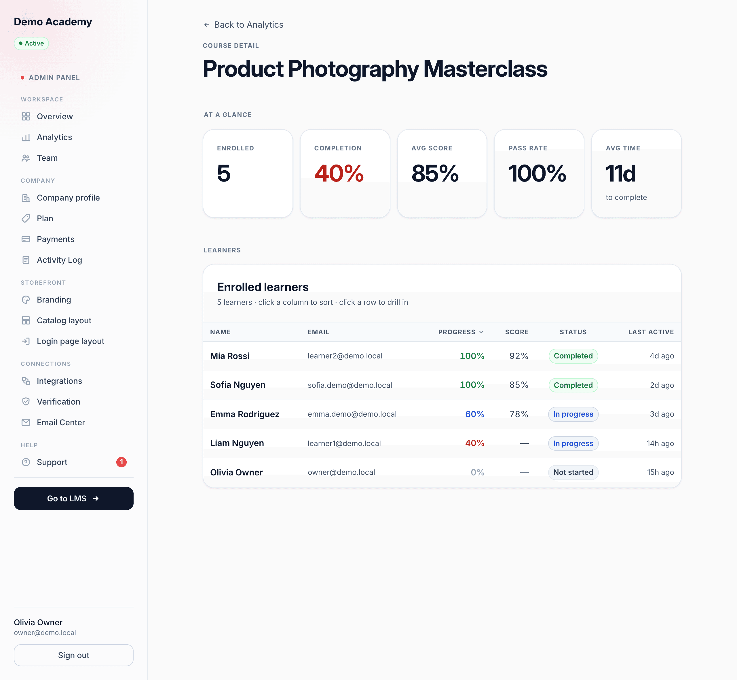
Click a course name in the performance table and you land on that course’s own page, headed Course detail with a Back to Analytics link. Its At a glance tiles are Enrolled, Completion, Avg score, Pass rate, and Avg time (days to complete).
Below that, Enrolled learners lists everyone in the course, sortable by Name, Email, Progress, Score, Status, or Last active. Here “status” is the enrollment status — how far this person is through this course:
- Completed — finished the course.
- In progress — started, not yet done.
- Not started — enrolled but hasn’t begun.
Click any learner row here to jump onward to that learner’s own page.
Open a learner (the learner drill-down)
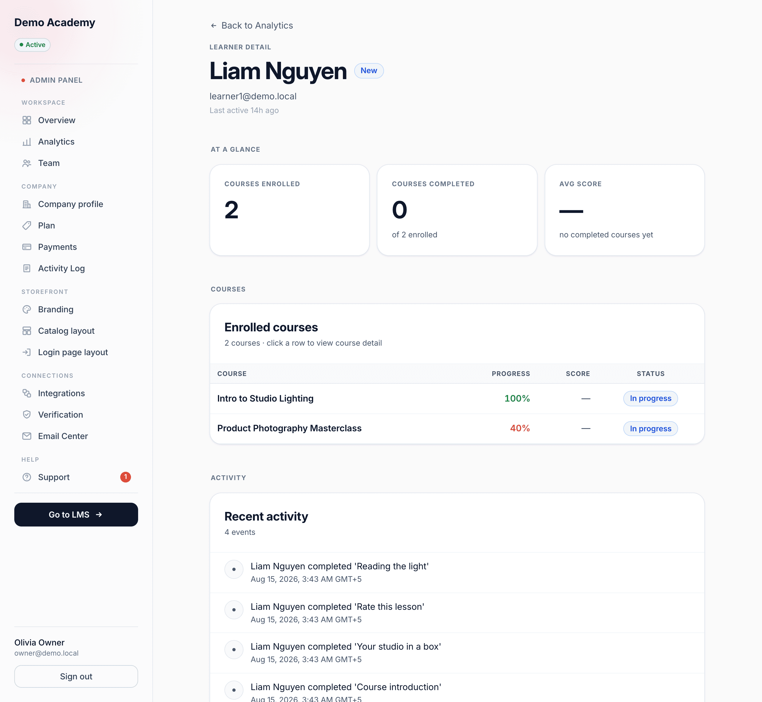
Click a learner row — from the main learners table or from inside a course — and you get their profile, headed Learner detail. Their name sits next to a coloured status pill, with their email and when they were last active. The At a glance tiles are Courses enrolled, Courses completed (shown as “of N enrolled”), and Avg score.
Enrolled courses then lists every course this learner is in, each with its Progress, Score, and enrollment Status — and clicking a row takes you to that course’s detail page, so you can hop between people and courses freely. Finally, a Recent activity timeline shows this learner’s own events, newest first, each with a full date and time.
What each learner status means
The Active / New / At risk / Inactive labels aren’t set by hand — Learn 360 works them out from each learner’s activity, so they stay honest on their own:
- New — enrolled within the last 7 days. Fresh faces, still finding their feet.
- Active — has done something in the last 30 days. Engaged and moving.
- At risk — enrolled, hasn’t completed anything yet, and has gone quiet for 7 to 30 days. The people worth a nudge before they drift.
- Inactive — no activity for 30+ days (or never active). Dormant for now.
Because these are derived from real behaviour, they update themselves as people come and go — pair the At risk status with the Email Center to reach the learners who need a reminder.
New to the dashboard layout? The dashboard tour shows where Analytics sits alongside everything else in the Admin Panel and LMS.